
The Vibe Coder's Morning Routine: From 47 Tabs to One Dashboard
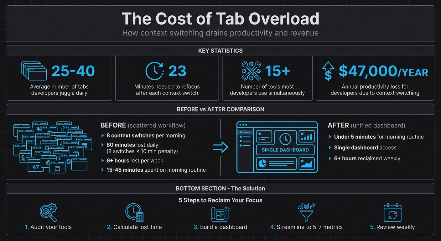
Juggling dozens of tabs every morning? It’s draining your focus and costing you time. Switching between 25–40 tabs can waste up to 23 minutes every time you refocus, adding up to hours lost each week. For developers, this inefficiency could mean losing thousands of dollars annually in productivity.
The solution? Consolidate your tools into one dashboard. By centralizing key metrics like GitHub activity, Stripe revenue, and uptime monitoring, you can simplify your workflow, reduce distractions, and save hours every week.
Here’s how to get started:
- Audit your tools: List every app you open daily and categorize them as “Essentials” or “On-Demand.”
- Calculate lost time: Track how often you switch tools and estimate the time wasted.
- Build a dashboard: Use tools like Bax to integrate your key metrics into one view.
- Streamline your workflow: Focus on 5–7 critical metrics and set up alerts for important updates.
- Review weekly: Regularly refine your dashboard to keep it efficient and relevant.
The Cost of Tab Overload: Time and Money Lost to Context Switching
Step 1: Review Your Current Morning Workflow
List Every Tool You Open Daily
Managing multiple tabs can sap your mental energy, so the first step is to map out your morning routine. Start by listing every tool and browser tab you open before 11:30 AM [5]. This will give you a clear picture of your current workflow.
If you're like most developers, you're juggling 15 or more tools at once [5]. Your list might include your IDE (like VS Code or Cursor), GitHub for pull requests, Slack for team communication, Jira or Linear for tracking sprints, cloud platforms like AWS, Vercel, or Supabase, analytics dashboards, and even utility tabs for tasks like JSON formatting, JWT decoding, or Base64 encoding [3][2][5].
Once you’ve got your list, split your tools into two categories: "Essentials" - the ones you use most of the time, like your editor and GitHub - and "On-Demand" apps, which you only open occasionally, like when debugging [5]. This breakdown will help you figure out which tools are crucial to your workflow and which ones might just be adding clutter.
After categorizing, take it a step further by assessing how these tools impact your focus. This will help you understand the cost of constant context switching.
Calculate Time Lost to Context-Switching
Did you know that every time you switch tasks, it takes about 23 minutes to refocus [5]? That’s a big deal.
To figure out how much time you’re losing, estimate how often you switch between tools each day and multiply that by 10–20 minutes [8]. For instance, if you switch between tools six times before lunch, you’re losing somewhere between 60 and 120 minutes of productive time. Spread that over a week, and the numbers really add up.
As Somadina, a technical writer, explains:
Productivity isn't about how many dashboards you can open. It's about how few you actually need [5].
For a developer, these lost minutes can translate into a staggering $47,000 per year in reduced productivity [7]. And if you’re an indie developer or solopreneur, the stakes are even higher. Lost time doesn’t just hurt your schedule - it can seriously impact your financial stability. By calculating this lost time, you’ll have a solid case for streamlining your tools into a single, more efficient dashboard.
sbb-itb-5b9029c
Step 2: Identify Your Dashboard Requirements
Choose Your Most Important Tools and Metrics
Once you've pinpointed where your time is slipping away, it’s time to focus on what really matters for your dashboard. The goal? Highlight metrics that drive decisions and inspire action. Take Shane Larson, Founder of Grizzly Peak Software, as an example. His weekly dashboard zeroes in on just five key metrics: organic sessions (4,200 per week for Grizzly Peak), Search Console positions, revenue by source, server costs (around $42 per month), and content velocity (with a target of three articles per week) [10]. Every Sunday, Shane spends 40–50 minutes manually reviewing these numbers in a spreadsheet. This process helped him spot a traffic plateau on AutoDetective.ai, leading to a content strategy adjustment after a Google core update.
The takeaway? Actionability is everything. If a metric doesn’t influence your decisions, it’s just clutter [12]. For indie developers, the most impactful metrics often fall into four categories:
- Repository management: Think commits and pull requests.
- Revenue tracking: Metrics like MRR/ARR from platforms like Stripe.
- Uptime monitoring: Covering server costs and availability.
- Traffic growth: Organic sessions tracked through Google Analytics [10].
"The discipline of choosing what NOT to track is just as important as choosing what to track. Every metric you add to your dashboard is a potential source of anxiety, distraction, or misguided optimization."
- Shane Larson, Founder, Grizzly Peak Software [10]
Focus on metrics that reflect long-term growth, like organic traffic, rather than vanity stats like social media followers [10]. For instance, a 30% user retention rate after seven days signals strong engagement [9], while bounce rate often offers little actionable insight for content-focused sites [10]. To avoid overwhelm, stick to the essentials and refine your dashboard with only the tools and data that truly matter.
Keep Your Dashboard Focused
Don’t let your dashboard become a dumping ground for every tool and metric. Overloading it can lead to fatigue and inefficiency. Think of it like a pilot’s cockpit - only the most critical instruments make the cut [10]. Aim for 5–7 essential tools on your dashboard. If you’re not checking a tool at least twice a day, it probably doesn’t deserve a spot on your primary dashboard.
Prioritize tools you use constantly, like your IDE (e.g., Cursor), GitHub, and Slack. Save secondary tools, such as Jira or analytics platforms, for scheduled reviews [5].
Why does this matter? Switching between platforms can cost you focus - about 23 minutes and 15 seconds every time you shift gears [5][11]. By keeping your dashboard streamlined, you can minimize distractions and maximize productivity.
Step 3: Set Up Your Dashboard with Bax
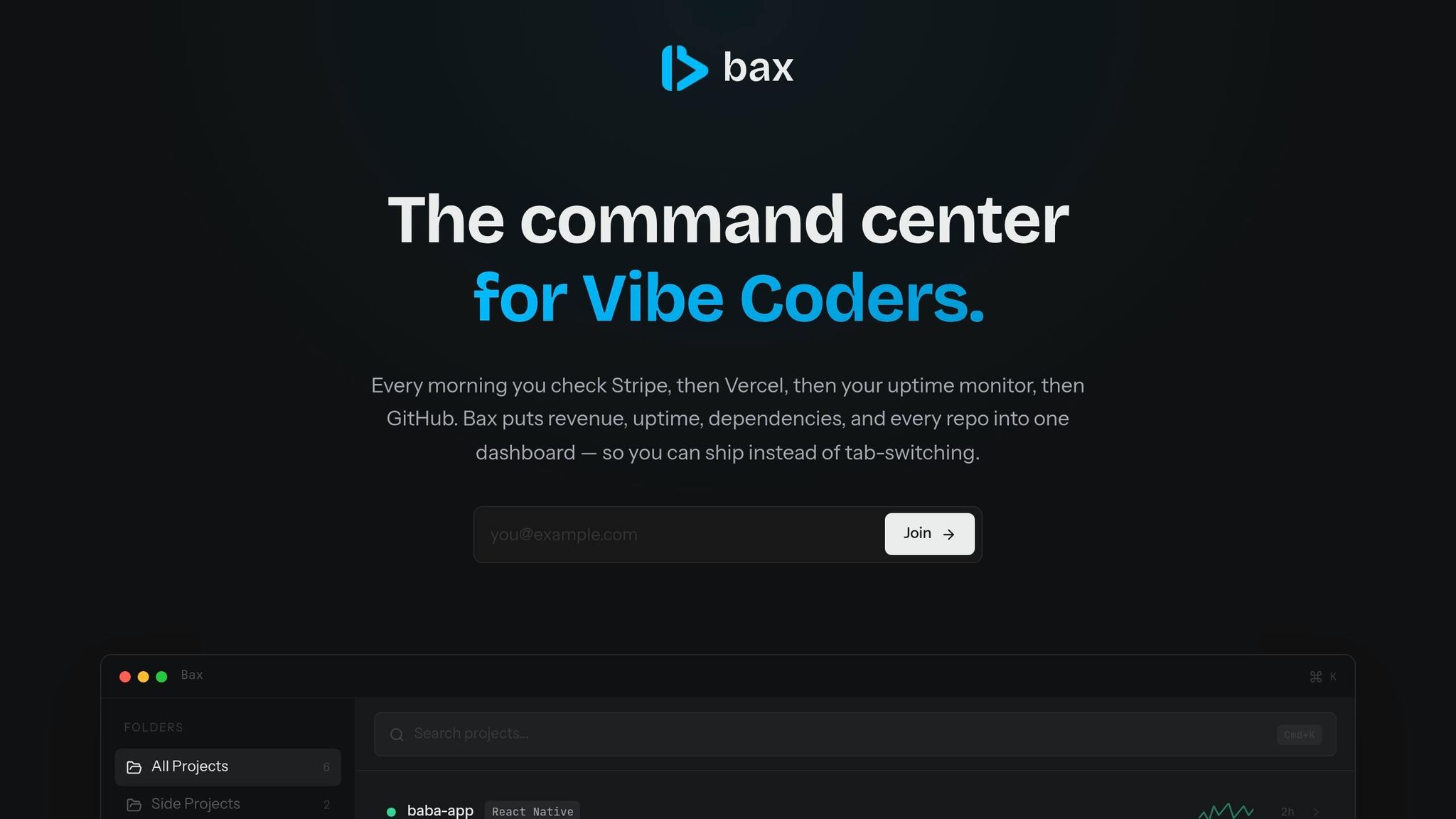
Link Your Accounts and Services
Start by connecting your essential tools to Bax. The platform works seamlessly with over 140 services, including GitHub, Stripe, Vercel, and Linear, automatically detecting integrations from your codebase. For GitHub, you’ll need to set up a Vercel Token in your repository secrets. Go to Settings > Secrets and variables > Actions and store it as VERCEL_TOKEN to ensure secure CI/CD pipelines [13].
Stripe integration is handled through the Vercel Marketplace (available since March 5, 2026). This setup automatically provisions API keys as environment variables for both sandbox and live environments. According to Vercel:
The integration securely provisions your API keys as environment variables and supports both sandbox and live modes. Test your payment flows in sandbox, then move to production without manually exchanging or managing keys [14].
For Linear, you can enable the "Convert to Issue" feature by authorizing OAuth for your workspace. This allows you to turn Vercel Preview comments into actionable Linear issues [15].
Once your accounts are linked, you can personalize your dashboard to better align with your daily tasks.
Create Custom Views and Set Up Alerts
After connecting your accounts, it's time to design custom views that reflect your workflow. Bax allows you to build dashboard widgets using JSON results, entity highlights, event tables, and "Pending Actions" to keep track of tasks [16]. These views can help you monitor key areas like repository activity, revenue, and system uptime.
To stay ahead of potential issues, set up alerts with specific trigger conditions, alert frequencies, and expiration timers. This way, you’ll catch problems early without being overwhelmed by unnecessary notifications [17]. Custom views and alerts ensure you only see the most relevant data while maintaining a secure and efficient workflow [16].
Now, let’s take it a step further by integrating AI into your process.
Use AI Analysis Features
Bax’s AI tools take over many time-consuming tasks, such as analyzing repository health. It identifies security vulnerabilities, checks for pattern inconsistencies, and flags missing error handling, significantly cutting down on manual code reviews [6].
By incorporating AI, you can improve operational efficiency by up to 30% and reduce manual errors by 25% [19]. To get the most out of this feature, provide clear, contextual prompts about expected behavior, which helps the AI deliver more precise fixes [6]. Additionally, the AI can pull actionable tasks from notes or transcripts and add them directly to your to-do list, reducing the burden of administrative work [18].
These AI-driven features are designed to help you stay focused, minimize distractions, and manage everything from a single, streamlined dashboard.
Step 4: Build Your New Morning Routine
Start Your Day with a Focused Workflow
Ditch the chaos of juggling 25–40 tabs every morning by switching to a single, streamlined dashboard workflow [1].
Kick things off by opening Bax as your "buffer zone" before diving into emails or Slack [20]. This intentional pause helps you filter out distractions and zero in on what’s important. Use this time to check the health of your repositories - look for failed builds or pull requests waiting for attention. Review key Stripe metrics like MRR, churn rates, and growth trends, and ensure uptime for critical revenue paths such as payment processing and API health [4]. Some founders admit they used to check Stripe dozens of times a day before creating a more efficient system [11].
Next, use AI tools to analyze your active projects and identify your top-priority task. Once you’ve got your focus, open your code editor - whether it’s Cursor, VS Code, or Windsurf - and get to work. This kind of structured routine beats a scattered, tab-heavy workflow and saves you the time and energy of constantly refocusing [11].
"I used to open Stripe before breakfast. Now I just glance at my menu bar. It sounds small but it changed how I start my day."
- Arda K., Indie SaaS founder [11]
With this optimized approach, you'll benefit from a faster, more efficient way to start your day.
Simplify Navigation with One Shortcut
Make your routine even smoother by using a single keyboard shortcut to access everything you need.
Bax’s command palette, triggered with Cmd+K (or Ctrl+K on Windows), lets you navigate projects, check deployments, or view revenue stats instantly [12]. Forget the frustration of hunting through menus - just type what you need, and you’re there. This text-based navigation keeps you in the zone, reduces interruptions, and helps you stay focused on building.
Step 5: Track and Improve Your Time Savings
Compare Your Workflow Before and After
Take a closer look at how your workflow has changed by conducting a simple audit. Start by listing every tool you use during your morning routine, and note each time you switch between platforms - like moving from your code editor to Stripe, then to GitHub, and back to email. Research shows it can take up to 23 minutes to fully regain focus after each switch, but for simplicity, assign a 10-minute penalty per switch to estimate your lost time [1][5][8].
Before streamlining, solo founders often spent 15–45 minutes each morning on these context switches. By consolidating tools and workflows, this time can shrink to under 5 minutes [4][10]. For instance, if you previously made 8 context switches per morning, costing 10 minutes each, you’ve just reclaimed 80 minutes a day - over 6 hours of extra productivity every week. These numbers highlight how vital it is to perform regular audits to maintain and refine your workflow.
"The weekly review is where data becomes decisions. It's where patterns become visible and adjustments become intentional."
- David Allen [24]
Use these audits to fine-tune your setup and ensure your system keeps working for you.
Review Your Dashboard Setup Weekly
Once you've assessed your workflow, dedicate 15 minutes every Sunday morning to review your dashboard setup [24]. Focus on which metrics you actually use and which ones you ignore. If a chart doesn’t lead to actionable insights, remove it [12]. Keep your dashboard simple by sticking to 5–7 key metrics to avoid overwhelming yourself [22][23].
Consider adding a "Notes" column to document why specific metrics changed and what actions you took in response [10]. This hands-on approach helps you catch subtle trends that automated charts might not highlight. Also, clean up your workspace by removing unused views and temporary "TEST" dashboards. This regular cleanup keeps your system focused and efficient [21].
Conclusion
Main Points to Remember
Switching from juggling 47 tabs to using a single dashboard can help reclaim your focus and improve productivity. Too many tabs create clutter and mental fatigue, while a unified dashboard reduces constant context switching, allowing you to concentrate better.
With a unified dashboard, you can access all your critical project data in one place - whether it's GitHub commits, Stripe revenue, uptime monitoring, or dependency alerts. Instead of bouncing between tools, you’ll have everything you need at your fingertips, giving you more time to focus on creating features and building products.
The "vibe coding" approach thrives on momentum and quick iteration, but that only works if your tools support your flow rather than interrupt it. A streamlined dashboard focused on a few key metrics keeps you up to date without overwhelming you, turning chaotic mornings into calm, productive starts. This shift can set the tone for a more intentional and effective workday.
What to Do Next
To tackle "tab overload", start by auditing your workflow. List all the tools you open each morning and track how often you switch between them. Pinpoint the 3–5 tools that drive most of your productivity and focus only on the essential data you need before diving into your work.
Try Bax to consolidate GitHub, Stripe, uptime monitoring, and dependency scanning into one streamlined dashboard. With the Free plan, you can manage up to 5 projects and access 3 AI analyses per month, making it an easy way to test if a unified dashboard fits your workflow. Use the Cmd+K command palette to navigate quickly between projects, and set up alerts so critical updates reach you without constant checking.
Make it a habit to review your setup weekly. Fine-tune your metrics, adjust alerts, and measure how much time you’re saving. The goal isn’t to create a perfect dashboard right away - it’s to gradually reduce the mental load of managing countless tabs and get back to what you do best: building and shipping great products.
Developer Organization and Productivity Tools
FAQs
What should my dashboard show first?
Your dashboard should put the most important and actionable data front and center. Begin with a project or operational overview that pulls together essential metrics, statuses, and alerts. This approach minimizes mental effort and keeps your attention on the priorities. Supporting details, like logs or less critical tools, can be positioned further down to maintain a smooth and efficient workflow.
How do I stop alerts from becoming noise?
To cut down on alert noise, try using suppression to silence non-critical notifications during maintenance windows or less urgent times. Adjust alert thresholds to highlight major deviations or first-time occurrences, which helps eliminate false positives. You can also set up filtering and routing so that only alerts requiring action make it to your attention. These approaches ensure you stay focused on critical issues without getting bogged down by unnecessary distractions.
How can I measure time saved after consolidating tools?
To figure out how much time you're saving, start by timing how long routine tasks or switching between tabs takes before consolidating your tools. For instance, track how much time you spend each day managing multiple tabs or juggling different tools. Then, compare that to the time it takes when using a single, unified dashboard. Another useful metric is to count the number of context switches or tab changes - these usually drop noticeably when everything is streamlined into one place.


