
I Replaced 6 Developer Dashboards With One - Here's What Happened
Managing multiple dashboards wastes time and interrupts focus. I replaced six tools - GitHub, Stripe, Vercel, and others - with one consolidated dashboard, saving over 2 hours weekly and improving productivity. Here’s what changed:
- Time savings: Reduced daily tool-switching from 100+ to a single tab.
- Improved focus: Eliminated constant interruptions, allowing for deeper work sessions.
- Simplified data: Unified insights across projects, cutting manual reconciliation.
- Lower costs: Consolidated tools reduced monthly expenses from ~$130 to $12.99.
Switching to a single dashboard transformed my workflow, allowing me to focus on development instead of managing scattered tools.
Developer Organization and Productivity Tools
sbb-itb-5b9029c
The 6 Dashboards I Was Using Before
Each platform played a key role, but none of them worked together seamlessly - leaving me to juggle manual tasks constantly.
GitHub: Managing Repositories and Pull Requests
GitHub was my go-to for managing code. I tracked pull request statuses across projects, monitored open issues, and kept an eye on branch activity [5]. But the lack of visibility across repositories was frustrating. If I needed to check GitHub Actions workflows or locate unreleased commits, I had to visit each repository individually [6]. This frequent hopping between tabs disrupted my workflow. Open-source maintainer Dhruv S. summed it up perfectly:
Checking scheduled GitHub Actions workflows requires visiting each repository's Actions tab individually... These manual workflows broke down for me once the number of tools reached double digits [6].
On top of that, Dependabot PR notifications often buried the updates that actually mattered. While GitHub's fragmented views slowed down code reviews, Stripe created its own set of challenges for financial tracking.
Stripe: Monitoring Revenue and Subscription Metrics

For my SaaS projects, Stripe was non-negotiable. It provided insights into key metrics like Monthly Recurring Revenue (MRR), Annual Recurring Revenue (ARR), churn rates, and Lifetime Value (LTV) [2]. But there was a catch - Stripe's data existed in isolation. Monitoring webhook health was especially tricky since silent failures could go unnoticed, resulting in revenue losses [2]. Trying to cross-reference Stripe timestamps with deployment logs manually was inefficient and prone to errors. This fragmented approach made it harder to get timely insights and increased the cost of switching between tasks.
Once I moved from code and revenue tracking to deployment monitoring, the inefficiencies only grew.
Vercel/Netlify: Uptime and Deployment Monitoring
Vercel and Netlify were my tools for deployment logs and uptime tracking [3][2]. I relied on their dashboards to confirm if services were live, debug builds, and resolve outages. But debugging could quickly turn into a time sink - sometimes taking 40 minutes to realize the issue was an external outage [3]. Developer DownOrNot captured this frustration well:
I didn't want 43 email subscriptions. I wanted one place to glance at and see: are my tools working or not? [3]
Without a centralized view, even answering a basic question like "Is the problem on our end or theirs?" meant opening multiple tabs and piecing together updates manually. It was a fragmented, time-consuming process.
Why I Needed to Consolidate: The Problems I Was Facing
Managing six separate dashboards became a serious drain on productivity. Constantly clicking between tabs and juggling tools didn’t just waste time - it disrupted workflows and slowed down progress on everything from feature development to decision-making.
Time Lost to Context-Switching
Switching between tools like GitHub, Stripe, and Vercel wasn’t just about clicking tabs - it meant losing the mental flow I had for the task at hand. Studies show it takes an average of 23 minutes and 15 seconds to regain deep focus after an interruption [9]. Multiply that by several dashboard checks a day, and the time lost adds up quickly.
After analyzing my workflow for a week, I found I was losing 36 minutes daily just switching between tools [11]. That’s nearly three hours a week - time that could have been spent shipping new features. On top of that, the constant switching made it harder to maintain a clear picture of the data. Somadina, a technical writer, summed it up perfectly:
Every click felt like a brain reboot [9].
Even worse, I noticed that 59% of the tasks I started were interrupted, and 29% of those never got finished [11]. This left many features stalled at around 80% completion as I chased deployment logs or tried to reconcile revenue data [12].
Fragmented Data and Insights
Using multiple dashboards created silos of information, making even simple questions difficult to answer. For instance, linking blog posts to revenue required manually cross-checking timestamps. The fragmentation also led to conflicting data - one tool might show steady conversion rates, while another suggested a decline. Instead of acting on insights, I spent valuable time reconciling these discrepancies [9].
Leadership reviews were especially frustrating. I’d be faced with "too many dashboards to count", each offering slightly different numbers [7]. Without a unified source of truth, decisions often felt like educated guesses. These gaps didn’t just complicate decision-making - they also disrupted my ability to stay focused as a developer.
Decreased Developer Focus and Productivity
Managing six dashboards wasn’t just a logistical challenge - it was mentally exhausting. The constant task-switching created a lingering cognitive load that reduced my productivity by as much as 40% [11].
This "attention residue" made it nearly impossible to enter a deep work state [11]. I’d open my code editor, but my thoughts would still be stuck on whether a Stripe webhook failure was critical. Without the ability to focus, I couldn’t reach the flow state where developers do their best work. Creator Leena Malhotra captured the impact perfectly:
The cost isn't just time. It's momentum [1].
This growing mental strain highlighted the urgent need for a consolidated dashboard to simplify operations and reduce distractions.
How I Set Up a Unified Dashboard
I brought everything together using Bax.
Connecting Key Services and Integrations
Getting started was simple. I chose GitHub from Bax's marketplace, which allowed me to connect all my repositories, pull requests, and commits seamlessly [15].
Then came Stripe. Bax gave me two options: create a new sandbox for testing or link my existing live account [13]. I started with sandbox mode to test the setup using sample card numbers before connecting my live account. Once integrated, Bax automatically handled environment variables across my projects, removing the hassle of managing .env files manually [13][14].
I also linked Vercel and Netlify, connecting each project in just a few minutes.
Features That Saved the Most Time
Once everything was integrated, Bax's advanced tools made my workflow much smoother.
The command palette (Cmd+K) became a game-changer. Instead of flipping through countless tabs or bookmarks, I could simply type the project's name and jump straight to its dashboard. Bax also offered one-click access to popular editors like Cursor, VS Code, Zed, and Windsurf.
Another standout was the AI-powered repository analysis. It saved me hours of manual documentation. For instance, in February 2026, the solo founder of Zenovay replaced a $130/month analytics stack with a $20/month dashboard by combining traffic analytics, heatmaps, and Stripe revenue attribution into one view. This setup made it easy to see which blog posts were driving revenue - something that previously required tedious spreadsheet work [8][16].
Bax’s project-centric organization was a huge improvement. Instead of bouncing between separate dashboards for GitHub, Stripe, and deployment updates, I could see all relevant metrics and resources for a product in one place [4][2].
Of course, while these features were incredibly helpful, the migration process wasn't without its hurdles.
Challenges During Migration
The migration wasn’t entirely smooth. One of the trickiest parts was syncing historical data from Stripe, which temporarily disrupted insights into long-term revenue trends. Setting up alerts also required some fine-tuning. Initially, I was bombarded with notifications, leading to alert fatigue. I eventually configured critical alerts to come through SMS and grouped routine ones into a daily digest [2].
There were also some inconsistencies in the data - metrics like conversion rates didn’t immediately match those from my original dashboards. Once I understood how Bax aggregated the data, I began to rely on it as my single source of truth. This eliminated the need to cross-check conflicting numbers across multiple tools. Resolving these issues helped solidify Bax as my go-to dashboard.
Results After 3 Months: What Changed
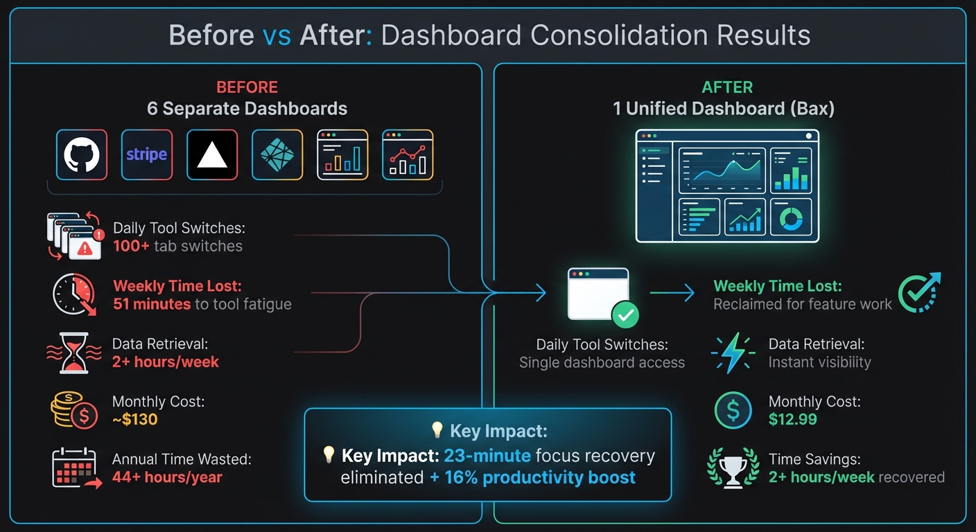
Before vs After: Consolidating 6 Developer Dashboards Into One
Before vs. After: The Numbers
Before switching to Bax, I was constantly jumping between dashboards - over 100 times a day. That added up to 51 minutes wasted every week, which translates to more than 44 hours a year just from tool fatigue [18].
Three months after adopting Bax, everything changed. Instead of managing six separate logins, I now open one tab each morning. Data retrieval that used to take hours became nearly instantaneous, giving me more time to focus on actual development work.
| Metric | Before (6 Dashboards) | After (Bax) |
|---|---|---|
| Daily Tool Switches | 100+ tab switches [18] | Single dashboard access |
| Weekly Time Lost | 51 minutes to tool fatigue [18] | Reclaimed for feature work |
| Data Retrieval | 2+ hours/week [8] | Instant visibility |
| Monthly Cost | ~$130 across tools [8] | $12.99 (Pro plan) |
These changes didn’t just save time - they reduced interruptions and boosted productivity significantly.
Improved Focus and Faster Shipping
The impact on focus was immediate. By cutting down on interruptions, I avoided the 23-minute recovery period that typically follows every context switch [20]. This gave me longer stretches of deep work, uninterrupted by the need to check deployments or monitor revenue metrics.
Feature delivery also sped up. Booking.com’s 2025 research highlighted that reducing manual tasks through consolidated tools can lead to a 16% productivity boost [19]. I saw this firsthand, with more frequent pull request merges and faster decision-making. Having a single source of truth eliminated the confusion that used to slow me down [18].
Consolidation - not tool expansion - will be the decisive productivity strategy for high-performing organizations.
Better Visibility Across Projects
Unified metrics brought clarity to project health and decision-making. Instead of jumping between Vercel for uptime, GitHub for pull requests, and Stripe for revenue, I could see everything at a glance. Security issues, like dependency vulnerabilities, appeared right alongside deployment status, ensuring they were addressed promptly [10].
Revenue tracking became effortless too. For example, a Zenovay founder managed to drastically cut analytics costs [8]. With Bax, answering questions like "Which feature drove conversions this week?" took seconds instead of hours - an invaluable improvement for staying agile.
Tips for Consolidating Your Own Dashboards
After dealing with the frustrations of fragmented dashboards, I discovered a few strategies that made a real difference. If you're looking to streamline your workflow like I did, here’s what worked for me.
Choose Tools That Fit Your Workflow
Don’t get caught up in flashy features. The real question is: does it fit your current tools and workflow? Make sure the dashboard supports your key APIs and handles authentication seamlessly, including refreshing OAuth tokens when needed [21].
Think about data freshness versus reliability too. While real-time webhooks sound great, batch processing every 5–15 minutes is often more dependable and easier to troubleshoot for dashboard purposes [21]. Most decisions don’t need second-by-second updates, and batch syncing avoids the headaches of webhook failures.
Also, look for tools that create a unified data model across all your integrations. For example, they should map terms like "Service Request" and "Ticket" into a single schema, so you’re not constantly translating between systems [21]. Bax’s Pro plan does this automatically, combining your essential services into a cohesive view.
Once you’ve chosen a tool that aligns with your workflow, it’s time to dig into its advanced features to make your life easier.
Use Advanced Features to Save Time
Consolidation is just the start - automation is where the real time-saving happens. Features like AI-driven repository analysis, weekly email summaries, and automated documentation can save hours of manual effort. The goal isn’t just fewer tabs; it’s freeing up time for actual development.
Incorporate a command palette (Cmd+K) for quick access to projects without touching your mouse [22]. This feature grows with you, keeping navigation smooth even as your workload increases. Pair that with instant editor launching - whether you use Cursor, VS Code, or Zed - and you’ll eliminate another layer of daily friction.
Start small when transitioning. Focus on replacing the tool that’s costing you the most time or money first [17]. Run the new dashboard alongside your existing tools for about two weeks to spot any issues before fully committing [17].
Conclusion
Switching from six dashboards to one has completely reshaped how I work. Without the constant interruptions of juggling multiple interfaces, I’ve gained back over 2 hours every week[8]. That’s time I can now dedicate to actual building rather than wasting it navigating endless dashboards. This shift has also brought noticeable improvements in response times and project oversight.
The benefits were undeniable: quicker incident handling, better visibility across projects, and the ability to make real progress in just 30-minute chunks without breaking focus. For indie developers and small teams, every minute spent wrestling with tools is a minute lost on shipping. A single, unified dashboard transforms that wasted time into meaningful development work.
If you’re stuck managing countless tabs or struggling with inconsistent data across platforms, consolidating your tools can tackle fragmentation head-on and bring back the focus you need to truly get things done.
FAQs
How do I pick which dashboards to consolidate first?
Start by reviewing the tools and data sources you currently rely on. Pinpoint the dashboards that are most important and frequently referenced - especially those that serve as a single source of truth or directly influence key decisions. Group your dashboards into three categories: keep, consolidate, or retire. To streamline the process, begin with one team as a test case. This allows you to focus on the most impactful dashboards while fine-tuning your strategy before expanding the effort to other teams.
Will a unified dashboard slow down or lag behind real-time data?
When using a unified dashboard, there's a chance it might display lagging indicators rather than real-time data. This delay often occurs because the dashboard pulls and consolidates information from various sources, and syncing everything can take time. While this isn't always a problem, you should consider whether your workflow demands real-time updates or if minor delays won't disrupt your processes.
How do I prevent bad data or alert fatigue after consolidating?
When consolidating dashboards, the key to avoiding bad data and alert fatigue lies in smart filtering and prioritization. Start by setting clear thresholds to minimize unnecessary noise. Tailor alerts to align with your specific needs, ensuring they focus on high-impact issues that truly matter.
By bringing multiple data sources into a single dashboard, you can simplify notifications, allowing critical alerts to grab your attention more effectively. However, it’s essential to regularly review and fine-tune your alert configurations. This helps eliminate redundant or low-priority notifications, maintaining data quality while keeping overwhelm at bay.


